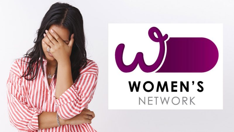
This is one serious c*ck up.
Over the ditch, Australians have been surprised with the new logo for the Prime Minister and Cabinet's Women's Network - and it's looking... very phallic.
Someone has made a 'ballsy' design move to create logo symbolising gender equality with a strong rounded 'W' alongside a rounded purple rectangle. But anyone with a pair of eyes can't unsee what it really looks like, and can't believe it's even real.
“I really thought this logo for the Department of the Prime Minister and Cabinets women’s network was fake but uh … do they know?” one person on Twitter wrote.
"Either someone has a very dark sense of humour, or..." wrote another.
"We have a winner... Worst logo of the century. Amazingly, this is absolutely real," another Twitter user declared.
Why didn't anyone consider giving this design to Shortland Street's Chris Warner? Cause we're sure he'd sum up this design very nicely.


